In a previous blog post One man, 366 logos, I took a closer look at the Swedish designer Fredrik Lundwalls retouch of several well-known brand logos. Lundwall challenged himself to redesign an existing logo each and every day throughout 2012, and the result of his work was numerous potential face-lifts to a variety of both old and new, international and regional brand logos.

In the blog post I tried to raise a discussion on the extent to which companies can change their logos over night. In my opinion logos can be improved over time, but there are some considerations that must be made in advance. A great example of this is Roskilde Festival, who recently decided to redesign their logo.
![]()
As a more or less neutral outsider with only one appearance on the grass fields of Roskilde, my personal opinion about the ongoing adjustments to the logo is predominantly positive. I think that the changes have adjusted the logo to an industry endlessly influenced by shifting trends, and I have my doubts about the 1973 editions ability to embrace the concept of the festival today.
At the same time, the continuous reshaping of the hallmark of Roskilde has been a great way to create attention/buzz about the festival – and there has been lots of activity on their social media platforms due to the latest face-lift. Within days from the launch, the first passionate supporter uploaded a picture of the new canopy tattooed on his leg on the Roskilde Festival Facebook-page, which has been a breeding ground for numerous discussions and dialogs about the new logo.
The canopy and the logo
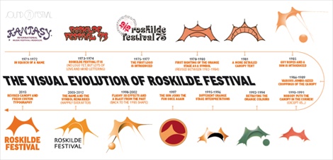
With the new logo Roskilde Festival has kept true to their “original” 1978 logo, in which the orange canopy was unveiled. Apart from operating as the visual trademark of the festival, the canopy also plays an important part in the history of Roskilde Festival. Originally, the canopy was produced for the Rolling Stones’ European Tour in 1976. In 1977 Roskilde Festival spotted the canopy on a photograph from the NME coverage of the Hyde Park Queen concert in London. It was love at first sight and in 1978 the orange canopy was unloaded to the fields of Roskilde. After Roskilde Festival 2000 the original canopy retired due to abrasion. The following year a new and slightly larger model was introduced, and the orange canopy has been synonymous with the Roskilde Festival ever since.
Since 1971, the festival, which is one of the largest of its kind in the Northern Europa, has kept on fine-tuning their logo, and the canopy, which is the hallmark of the festival, has yet again been reshaped.
The timeline below shows the progress of the Roskilde Festival logo.
Through the past years Roskilde Festival has received quite some critique on their musical profile, which has been rather fuzzy, according to both music reviewers and a large part of the festival crowd. Therefore, the logo face-lift might herald a new era in the history of Roskilde Festival. Based on the line-up for this year’s festival so far, this is exactly what the festival aims to do.
In terms of the new logo I think it suits Roskilde Festival very well, and as long as they stay true to the canopy and the orange colour, they can keep on fine-tuning the logo.
What do you think about the face-lift of the logo? Is Roskilde Festival moving into a new era? Feel free to share your thoughts.